Home Decor Colour Palette
A thoughtfully chosen colour palette forms the foundation of any successful interior design project. Colour palettes dictate the mood and atmosphere of a space, influencing how inhabitants perceive and interact with their surroundings. Understanding the principles of colour theory and how different hues work together is crucial for creating cohesive and visually appealing interiors.
Colour palettes generally consist of a dominant colour, secondary colours, and accent colours. The dominant colour takes up the largest visual space, often appearing on walls, flooring, or large pieces of furniture. Secondary colours complement the dominant colour and are used in moderate amounts, typically on upholstery, curtains, or smaller furniture pieces. Accent colours add pops of contrast and visual interest, appearing in accessories, artwork, and decorative elements. A well-balanced palette uses these colour categories strategically to create a harmonious and dynamic space.
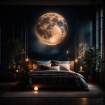
Several factors influence the selection of a suitable colour palette. The room's function is a primary consideration. A calming palette of blues and greens might be appropriate for a bedroom, promoting relaxation and sleep. A vibrant palette of reds and yellows could energize a kitchen or dining area, encouraging social interaction. Natural light also plays a significant role. Rooms with ample natural light can support bolder and darker colour choices, while rooms with limited natural light benefit from lighter and brighter hues to maximize the sense of space.
The architectural style of the home can further inform colour choices. Historic homes often suit traditional colour schemes, while modern homes allow for more contemporary palettes. Personal preferences, of course, are paramount. The chosen palette should reflect the individual’s taste and create a space that feels comfortable and inviting.
Exploring various colour schemes can help homeowners discover palettes that resonate with their vision. Monochromatic schemes utilize different shades and tints of a single colour, creating a cohesive and sophisticated look. Analogous schemes employ colours that sit next to each other on the colour wheel, producing a harmonious and visually pleasing effect. Complementary schemes use colours opposite each other on the colour wheel, generating a bold and dynamic contrast.
Triadic schemes incorporate three colours evenly spaced on the colour wheel, offering a balanced and vibrant combination. Tetradic schemes use four colours arranged in two complementary pairs, creating a rich and complex palette. Understanding these colour schemes provides a framework for experimenting with different colour combinations and developing personalized palettes.
The 60-30-10 rule is a useful guideline for balancing colour proportions within a space. The dominant colour occupies 60% of the room, the secondary colour occupies 30%, and the accent colour occupies 10%. This rule ensures that the colours work together harmoniously without overwhelming the space.
Testing colour choices is crucial before committing to a full-scale painting project. Paint samples allow homeowners to observe how colours appear in different lighting conditions throughout the day. Large paint swatches provide a more accurate representation than small chips and help visualize the impact of the chosen colours on the overall space. Considering the existing furniture and decor is essential when selecting a colour palette. The chosen colours should complement existing pieces and create a cohesive and unified aesthetic.
Beyond paint, colour can be introduced through various elements, such as furniture, textiles, and accessories. Rugs, throw pillows, curtains, and artwork provide opportunities to incorporate different colours and patterns, adding depth and visual interest to the space. Using texture alongside colour further enhances the visual appeal of a room. Combining different textures, such as velvet, linen, and wood, creates a layered and dynamic effect, adding another dimension to the overall design.
Staying updated on current colour trends can provide inspiration and inform colour choices. Design publications, online resources, and social media platforms offer insights into emerging colour palettes and design styles. However, personal preference should always take precedence over fleeting trends. Choosing colours that resonate with individual taste ensures a timeless and enduring design.
The psychology of colour plays a significant role in how colours influence mood and behaviour. Warm colours, such as red, orange, and yellow, are stimulating and energizing. Cool colours, such as blue, green, and purple, are calming and relaxing. Neutral colours, such as white, grey, and beige, create a sense of tranquility and balance. Understanding these psychological effects can help homeowners select colours that create the desired atmosphere in each room.
Creating a mood board can be a valuable tool for visualizing a colour palette and ensuring all elements work together harmoniously. A mood board can include paint swatches, fabric samples, images of furniture and accessories, and other inspirational elements. This visual representation helps refine the design concept and ensures all components contribute to the desired aesthetic.
Considering the flow of colour throughout the home is important for creating a cohesive and unified look. Adjacent rooms can benefit from harmonious colour palettes that transition smoothly from one space to the next. Using a common colour thread throughout the house can tie different areas together and create a sense of visual continuity.

8 Foolproof Color Palette Ideas For Every Room

Color Palette For Home 12 Combos Designers Love Havenly Interior Design Blog

8 Foolproof Color Palette Ideas For Every Room

Perfect Home Interior Color Schemes For You Domainsmoon Com Decor S O Decoración De Unas Colores Para Sala Comedor Salas Modernas

25 Home Decor Color Match Palettes Living Room Combination Modern Colors

15 Designer Tricks For Picking A Perfect Color Palette

Color Palette For Home 12 Combos Designers Love Havenly Interior Design Blog

20 Top Interior Color Schemes For Your House Design Foyr Neo

Color Palette For Home 12 Combos Designers Love Havenly Interior Design Blog

Top 5 Home Decor Color Trends 2025 Blog