The Allure of Orange and Green Home Decor: A Comprehensive Guide
The combination of orange and green in home decor can evoke a vibrant, energetic, and yet surprisingly harmonious atmosphere. These colors, often associated with nature and vitality, can be used in a multitude of ways to create visually appealing and psychologically beneficial spaces. Understanding the nuances of color theory and how these hues interact is crucial to successfully integrating orange and green into interior design schemes.
Orange, a secondary color derived from red and yellow, embodies warmth, enthusiasm, and creativity. Its presence in a room tends to stimulate conversation and foster a welcoming environment. Depending on the shade, orange can range from a subtle, earthy terracotta to a bold, citrusy burst of energy. Green, representing growth, harmony, and balance, is naturally calming and grounding. It connects us to the natural world and promotes a sense of well-being. Similar to orange, green offers a vast spectrum of shades, from deep forest greens to light, airy mint tones.
The successful integration of orange and green hinges on understanding their complementary and contrasting qualities. When used thoughtfully, they can create dynamic and inviting spaces. It is important to consider factors such as the desired mood, the existing architecture of the room, and the amount of natural light available. This article explores key considerations and practical applications of orange and green in home decor.
Key Point 1: Understanding Color Theory and the Orange-Green Relationship
Color theory provides a foundational framework for understanding how colors interact and influence each other. Within the color wheel, orange and green are considered analogous colors, meaning they sit next to each other. Analogous color schemes are generally harmonious and create a sense of visual unity. They are often found in nature, further contributing to their inherent feeling of balance. However, the degree of vibrancy and the specific shades chosen within the orange and green spectrum impact the overall effect.
Selecting the right shades is paramount. A bright, saturated orange paired with an equally vibrant green can be overwhelming in a large space, potentially creating a feeling of restlessness. In such cases, consider muting one or both colors. For instance, terracotta orange paired with olive green offers a more subdued and sophisticated aesthetic. Conversely, in a smaller space, a pop of bright orange against a backdrop of lighter, more muted green can add a touch of energy and visual interest without overpowering the room.
The undertones of both colors also play a significant role. Orange can have warm (reddish) or cool (yellowish) undertones, while green can lean towards warm (yellowish) or cool (bluish) tones. Pairing oranges and greens with similar undertones often creates a more cohesive and harmonious look. Conversely, mixing oranges and greens with contrasting undertones can create a more dynamic and visually stimulating space, but requires careful consideration to ensure balance.
Beyond analogous pairings, consider using orange and green as complementary accents to neutral palettes. A predominantly beige or gray room can be enlivened with pops of orange and green in the form of throw pillows, artwork, or decorative objects. This approach allows for a subtle introduction of color without committing to a fully saturated scheme.
The interplay of light and shadow further influences the perception of color. Natural light tends to enhance the vibrancy of both orange and green, while artificial light can alter their tones. It is important to assess how the chosen shades appear under different lighting conditions to ensure the desired effect is achieved.
Key Point 2: Practical Applications of Orange and Green in Different Rooms
The versatility of orange and green allows for their application in various rooms throughout the home, each requiring a tailored approach to maximize their impact. The desired ambiance and the function of the room should dictate the choice of shades and their application.
In living rooms, orange and green can be used to create a warm and inviting space for relaxation and socializing. Consider using a soft, muted green on the walls as a backdrop, complemented by orange accents in the form of throw pillows, rugs, and artwork. A statement piece, such as an orange sofa or armchair, can add a focal point and inject a sense of energy into the room. Plants, both real and artificial, are a natural way to introduce green into the living room, further enhancing the connection to nature. Choosing fabrics with textures that incorporate both colors, such as woven throws or patterned cushions, can add depth and visual interest.
Bedrooms, spaces designed for rest and rejuvenation, require a more calming approach. Opt for lighter, more muted shades of green, such as sage or mint, on the walls. Introduce orange sparingly as an accent color in the form of bedding, curtains, or decorative objects. The objective is to create a serene and tranquil environment that promotes relaxation. Avoid using overly bright or saturated oranges that could be disruptive to sleep.
Kitchens can benefit from the energizing qualities of orange. Consider using orange as an accent color on kitchen cabinets or backsplashes, paired with a neutral backdrop of white or gray. Green plants, such as herbs, can add a touch of freshness and vitality to the space. Appliances and accessories in orange can also inject personality and visual interest. However, it is important to balance the use of orange with cooler tones to prevent the kitchen from feeling overly stimulating.
Bathrooms can be transformed into spa-like retreats with the strategic use of orange and green. Soft, earthy tones of both colors can create a soothing and grounding atmosphere. Consider using a muted green on the walls, complemented by orange accents in the form of towels, bath mats, and decorative accessories. Natural materials, such as wood and stone, can further enhance the sense of tranquility. Avoid using overly bright or saturated colors in the bathroom, as they can be jarring and detract from the overall sense of relaxation.
Entryways, the first impression of a home, can benefit from the welcoming qualities of orange and green. A pop of orange on the front door or in the form of artwork can create a sense of warmth and hospitality. Green plants can add a touch of freshness and vitality to the space. A well-placed rug incorporating both colors can tie the entryway together and create a harmonious transition into the rest of the home.
Key Point 3: Utilizing Textures, Patterns, and Materials to Enhance the Orange and Green Palette
The successful integration of orange and green extends beyond simply choosing the right colors. The textures, patterns, and materials used in conjunction with these colors can significantly enhance their impact and create a more visually rich and layered space.
Textural contrasts can add depth and interest to an orange and green color scheme. For example, pairing a smooth, glossy orange vase with a textured, woven green throw can create a visually appealing juxtaposition. Consider incorporating natural textures, such as wood, stone, and linen, to further enhance the connection to nature and create a more grounding atmosphere. The interplay of light and shadow on different textures can also add dimension and visual interest.
Patterns can be used to introduce both orange and green in a subtle and sophisticated way. Consider using patterned wallpaper, fabrics, or rugs that incorporate both colors. Geometric patterns, floral patterns, and abstract patterns can all be used to create different effects. When using patterns, it is important to consider the scale and complexity of the pattern in relation to the size of the room. Smaller, more intricate patterns are generally better suited for smaller spaces, while larger, bolder patterns can be used in larger spaces.
The choice of materials can also influence the overall aesthetic of an orange and green color scheme. Natural materials, such as wood, stone, and bamboo, can create a warm and organic feel. Metal accents, such as brass or copper, can add a touch of sophistication and glamour. Glass and ceramic elements can add a touch of lightness and airiness. When selecting materials, it is important to consider their durability, maintenance requirements, and overall aesthetic compatibility with the chosen colors.
Incorporating natural elements is a particularly effective way to enhance an orange and green color scheme. Plants, both real and artificial, can add a touch of freshness and vitality to any space. Natural light can also enhance the vibrancy of both colors. Consider using sheer curtains or blinds to allow natural light to filter into the room. The use of natural materials, such as wood and stone, can further enhance the connection to nature and create a more grounding atmosphere.
Consider the use of metallic accents to elevate the overall design. Gold, brass, or copper can complement both orange and green, adding a touch of luxury and sophistication. These metals can be incorporated through lighting fixtures, picture frames, or decorative objects. However, it is important to use metallic accents sparingly to avoid overwhelming the space.

23 Colors That Go With Orange Living Room House Interior Green

Green And Orange Living Room Vibrant Couch

Stylish Orange Color Schemes For Vibrant Fall Decorating Living Room Home Decor Rooms

Redecorate Your Space With Orange

Living Room Decor Orange Home Bedroom Apartment

40 Orange Living Room Ideas Photos Decoración De Unas Decoracion Interiores Pintura Colores Casas

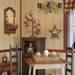
Living Room Orange Green Decor

Living Room May 2025 Decor Orange Green

Green And Orange Color Palette Interior Design Ideas Living Room Burnt

Premium Ai Creative Fall Home Decor In A Pastel Orange And Military Green Palette Background Generated